Category Archives: Comedy

This is 40 Poster

Ok, honestly, you know what most caught my attention in this poster? No, not the scene of Paul Rudd in the toilet. No, not the iPad, apparently thrown in to make the old “going to the bathroom in front of your significant other” gag seem more hip and modern. No, not even the pretty clever tagline. What most caught my attention is that Paul Rudd and Leslie Mann are apparently aging backwards, because they looked older a few years ago in Knocked Up.

And I know, super normal, these things are always retouched to oblivion. BUT THE MOVIE IS CALLED THIS IS FORTY! And I’m sorry, but this is not forty. Not even for these two biologically very special individuals.

(Via)

To Rome With Love Poster

I don’t have much to say about this poster for To Rome With Love. Well known style, a functional, but not very exciting one. But I would like to point out that adding a little bit of texture to the backgrounds really does wonders to make this pleasant to look at. A more typical solid white background would be much more of a sore for the eyes, and would make the whole thing look less classy. So, good call on that.

Totally Random Poster of the Week: Rubber

From the Wikipedia article:
“In the California desert, a tire comes to life and embarks on a killing spree as an audience watches the events unfold through binoculars. The tire kills by vibrating intensely and psycho-kinetically causing people’s heads to explode.”
To be honest, this sounds like one of those concepts that sounds great on paper, but doesn’t really translate into an engaging feature length film. But I could be wrong! And the posters certanly are something.

(Via)


Young Adult Poster

Young Adult Poster

Young Adult is the name of this movie. It is also a lit genre. And the film has as its main character an author (of young adult books? I don’t know). So, inspired by all that, we get a poster that looks like a book cover. Clever idea, and they really went the extra mile here to make it look like a book, to the point where the poster looked slightly off at first to me, until I figured what was going on.

I do wonder if this looks like a cover for a Young Adult book though. I mean, it looks oddly antiquated to me. The emphasis on being a hard cover, the colors and the scratches are particularly jarring. The actual picture inside the cover reads to me a lot more like something you might see in the cover of an YA book, not so much in the details, but in the overall feel.

I guess that without emphasising the hardcover it’s hard to portray book? Not much difference between the cover of a paperback and a movie poster, really. Well, very different traditions and tropes, but nothing that clearly would scream “This is a BOOK!”

Then again, maybe it all ties in into the themes of the film? Maybe the main character (played by Charlize Theron, by the way, who, in a choice that feels true to book covers, doesn’t actually show her face) is getting older but still trying to act like she is young? And this is represented by the worn out hard cover for a Young Adult book? Could be!

As you can probably notice, I’ve thought quite a bit about this poster in the last few days. And because of that I’m much more aware of the film than I was before. Not that there was ever a chance that I wouldn’t go see the movie in theaters, but anyway, maybe it had the same effect in someone who was a more iffy prospect.

(Via)

The Artist Poster

The Artist Poster

So, for context, ‘The Artist’ is a movie about a silent star struggling with the advent of sound, that itself is a black and white silent movie. It was apparently quite the hit in Cannes and will be released in the U.S. in November.

The poster, which is mostly black and white (and silent!) is perfectly evocative of that coolness and glamour we now associate (fairly or not) with the pre-sound period, and clearly marks the film as a high-minded, ‘artistic’ film. It’s not necessarily very evocative of the actual posters that were produced back them, but that doesn’t strike me as very important. This is, after all, a modern film, catering to a modern audience, despite the use of old-fashioned techniques.

(Via)

American Reunion

American Reunion Poster

I’m pretty sure American Reunion is a bad idea, likely to lead to a bad movie. I mean, considering that this series has already released a bunch of straight to video films, how can I believe that this is anything but a somewhat desperate attempt from a bunch of people to revive more successful days? Considering that the third movie was clearly already meant to be a final outing, what makes this one any more of a “last”? And doesn’t the fact that they had to go back to a gag from the very first movie show that this is a series that ran out of steam a looooooong time ago?

That said, this is the movie, and all the advertising people can do is work with whatever material they have. And this is a pretty good example of doing that. They created a simple, clean and clearly identifiable image that makes us think of the best moments in the series. Can’t really ask for much more than that.

(Via)

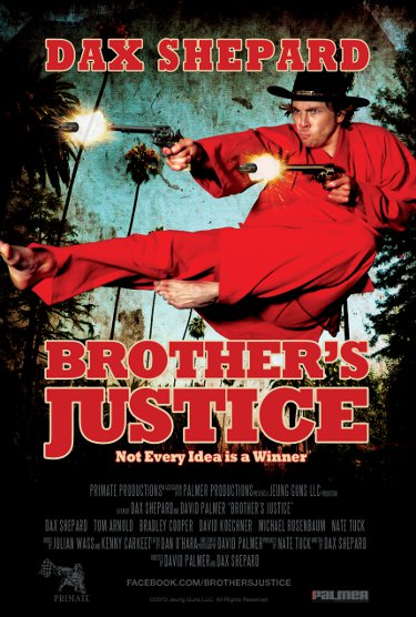
Brother’s Justice Poster

Brother's Justice Poster

Poor Dax. Poor, poor Dax.

I feel sorry for the guy, but I’m afraid he has no one to blame but himself. After all he is not only the star of the film, but also the writer and director. And I wouldn’t be surprised to find out that he is also doing the posters.

Just for future reference, if you are making a parody film that doesn’t mean that your poster has to be horrendously ugly. Also, if you are going for the low budget action film aesthetic in the poster, there is such a thing as too much authenticity.

I think the comparison to the very similar, going for the same effect poster for The Other Guys is interesting. Sometimes less is more, lose the awful background in the poster above and it would already be 100% better.

No Kidding Sherlock

The Sherlock Holmes posters so far have been pretty consistent visually, always sporting some fog, and blue tinge (a little more pronounced here) and backgrounds that scream period. Not earth shattering stuff, but distinctive enough to to be remembered and essentially ok for a movie which will be sold as “Robert Downey Jr. IS Sherlock Holmes!” anyway. Just get Downey out there looking like Sherlock and make a poster that isn’t completely boring to look at.

The humor is throwing me off a little bit though, especially as portrayed by the tagline. “Holmes for the Holiday”. Are we supposed to consider this to be an example of the supreme wit that will be displayed by Sherlock in the movie? My guess is that the film will have the kind of combination of drama and sometimes caustic humor that we see in, to pick the most obvious example, House, but the tagline isn’t exactly giving me confidence that they got the humor part of the formula right. And to be quite honest, Jude Law’s expression isn’t quite encouraging either.

This are probably just quirks of the poster, not very representative of the actual movie. But it would be nice if they were gone

(Via IMPAwards)

The Title That Changed

In the transition from the UK to America The Boat that Rocked got a new title and a slightly different poster. I guess they thought the original just wasn’t zany and fun enough, so we get more people walking the plank (including a girl!), a second, more party-centric boat, and some stuff in the title. Oh yeah, and curiously enough a different angle of the main boat.

I like the cleaner UK poster better, from a purely aesthetic perspective, but I understand what they are trying to do with the American one. I’m not sure they haven’t gone too much into Animal House territory but I understand. And it must be said that new title fits the poster’s concept much better.

The Informant Poster

What I love about this poster is how the combination of the type and the way that the title is broken into several lines allows me to think of a 50’s style monster movie about the terrible inform-ant. Much more dangerous than your regular giant ant.

Beyond that this is the second poster for the movie and so far the posters are weird, filled with a strange energy and terribly amusing to me. I’m not entirely sure the posters are really doing a great job selling the movie, and I don’t think I get much of a sense of what the film will be like based o them. But at least they got me interested.

(Via IMPAwards)